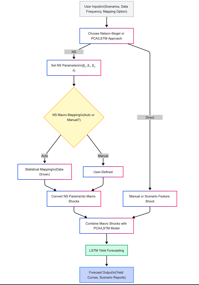
In the world of finance, yield curve forecasting plays a crucial role in managing risk, setting strategy, and meeting regulatory requirements. Traditionally, financial institutions have relied on parametric models—like the widely respected Nelson-Siegel (NS) approach—which use a handful of interpretable parameters (β₀, β₁, β₂, λ) to capture the stylized behavior of interest rate curves. These models are prized for their simplicity, transparency, and their strong connection to economic intuition.
However, the financial landscape has evolved. The explosion of available data, coupled with rapid market changes, has led to the rise of machine learning (ML) and artificial intelligence (AI). Modern AI models—especially those using techniques like Principal Component Analysis (PCA) for data reduction and Long Short-Term Memory (LSTM) neural networks for time-series forecasting—are capable of detecting complex, nonlinear patterns and adapting to new information with unprecedented accuracy. Yet, these models are often criticized for being “black boxes,” making it hard for stakeholders to understand or control the outputs.
Many organizations face the challenge of transitioning from trusted, regulatory-approved legacy models to new AI-driven frameworks. This transition is often risky and costly, and there is understandable resistance to abandoning the clarity and auditability of parametric models for the opacity of deep learning.
By empowering users to calibrate yield curve forecasts through familiar NS settings or advanced AI-driven statistical mapping, our platform accelerates digital transformation while preserving institutional know-how. The result: forecasts that are not only powerful and flexible, but also transparent and actionable.
The Nelson-Siegel (NS) model describes the shape of the yield curve using a few key numbers (called β₀, β₁, β₂, and λ) for each economic scenario. These numbers control the overall level, slope, and curvature of the curve.
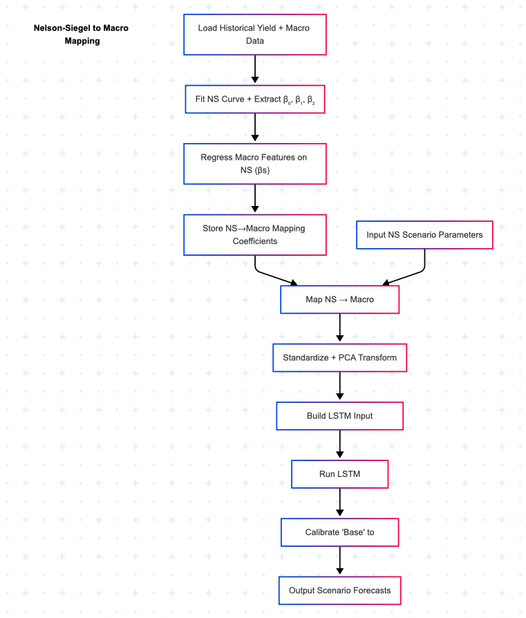
In our hybrid approach, we add a new layer: the NS Macro Mapping. This is like a translation table that takes the NS curve settings (β₀, β₁, β₂) and turns them into adjustments (or “shocks”) for important economic factors—such as GDP, inflation (CPI and PCE), the Fed Funds Rate, and the Unemployment Rate.
This means you can build scenario curves in a way that matches your economic view or stays true to real historical patterns. Whether you want to create custom, stylized scenarios or rely on actual data, the NS Macro Mapping gives you the flexibility and control to do both—all within the same platform.
By default, the NS Macro Mapping is set up using statistics from real historical data. This means the system automatically calculates the best-fit settings for you, and it adjusts itself whether you’re working with daily, weekly, or monthly data.
But you’re not locked in—you can take control! If you want to use your own custom settings instead of the automatic ones, just uncheck the “Use Statistical Mapping” box. This makes the table editable, so you can type in your own numbers and design scenario forecasts that are as bold, conservative, or creative as you want.
By default, the system figures out the best mapping settings for you using real historical data. It does all the heavy lifting—automatically adjusting to fit daily, weekly, or monthly data.
But you’re always in the driver’s seat. If you want more control, just uncheck the “Use Statistical Mapping” box. This unlocks the table, so you can type in your own numbers and create forecasts that match your own ideas—whether you want to be extra cautious or try something bold.
In short: you can rely on smart, data-based settings to start, but you’re free to jump in and customize anytime you want.
This NS-to-macro mapping gives you an easy way to build scenarios that make sense—not just to computers, but to real people. The system is smart enough to use data and math but also clear enough that you can see exactly what economic assumptions are being made for each scenario.
If you’re not a technical expert, you’ll still be able to understand what’s driving the forecast. And if you are an expert, you can tweak the mapping to better fit your view of the market, or to test out extreme “what if” situations.
In short: it keeps things transparent, flexible, and useful for everyone.
This AI-driven forecasting approach, combined with scenario-based modeling and policy shift duration, provides a powerful and flexible tool for financial decision-making. By simulating various economic conditions and considering the gradual impacts of policy changes, it offers valuable insights for investors, policymakers, and analysts, helping them navigate an uncertain economic landscape.